Sunday, May 16, 2010

Project 3: Wk2 First Attempt

The purpose of this set of A3 presentation panels is to document our development process, of site analysis and narrative conception. Having grown up as a small kid in Newtown I do have some fond recollections of the area, particularly being taken to the park by my nona and omi and going to the shops on King Street. Since moving out of the area I've had very little to do with it, only coming occasionally for social get-togethers. So in some ways I indulgently chose site 1 as it spoke to my childhood, and was the perfect excuse to just hang around these old familiar places.

The layout of the panels deliberately mirrors the progressive development of my thoughts, based on the creative influences of the area and my chosen artwork theme. I have chosen to go for the artwork of Bill Henson because I have always admired his ability to capture the feeling of inhabiting marginalised and seemingly abandoned areas- and their dark,ominous character. I have always been captivated by the eaerie and ghostlike tonal qualities he picks up in the skin of his characters. Henson also eloquently frames the inner conflict of his human subjects, drawing out complex emotional states that you can definitely identified with. The times when you have doubt and fear caught up in desire. Importantly, the graphic and tonal nature of his work will be a great starting point for design exploration. I constructed the narrative based on spending time amongst the characters of the area, and really trying to create someone identifiable.

Monday, May 10, 2010

Project 3: Wk 1 First Attempt


Just went for a quick site visit after work to become familiar with the sites and the immediate area, to start considering which site could offer the most opportunities for playing with ideas of organisation of circulation and manipulating interesting lighting qualities. Site 1 was the longest and narrowest envelope and has a number of interesting contextual qualities: the strong presence of Aboriginal art round the back; the unrestricted access to the Lennox St backstreet and Camperdown Memorial Rest Park; and the neighboring icons of student culture such as the Dendy Cinemas and small restaurants; and the almost maligning presence of the church.


Site 2 was very intriguing in terms on the shape of the envelope of the corner site, more like a blob that a long slug, and the potential openness it offers- not to mention the opportunity to experiment with integrating the direction of the surrounding streets with the form and using them to determine the openings. What was unfortunate was the lack of any distinctive cultural symbols in the immediate proximity at the back of the site around Wilson St and Erskineville Rd, with just some housing and anonymous commercial buildings. However it is so close to Site 1 that it could arguably still respond to the Dendy and small resteraunts across King St. Would be interesting if the Varga Bar could be maintained as part of the gallery.

Site 3 was the least appealing to me in the sense that it is not only sandwiched in like Site 1, but it lacks an interesting envelope and does not penetrate though to Lennox St to open out to the park. However it is surrounded by public art influences, which encourage free collaboration in the sense of just being able to post up sheets of scribble with chalk, without ruining the heritage art. From the point of view of an art dealer it is also strategically placed on the King St Enmore Rd intersection, maximising exposure. There is a small alley off Eliza St for off street access, but it is not big enough to really engage with the public like it is in Sites 1+2.

From this point I just want to start thinking of the narrative for my dealer and a quick parti organisation, and which site sparks the most interesting ideas.

Thursday, May 6, 2010

Project 2: Submission

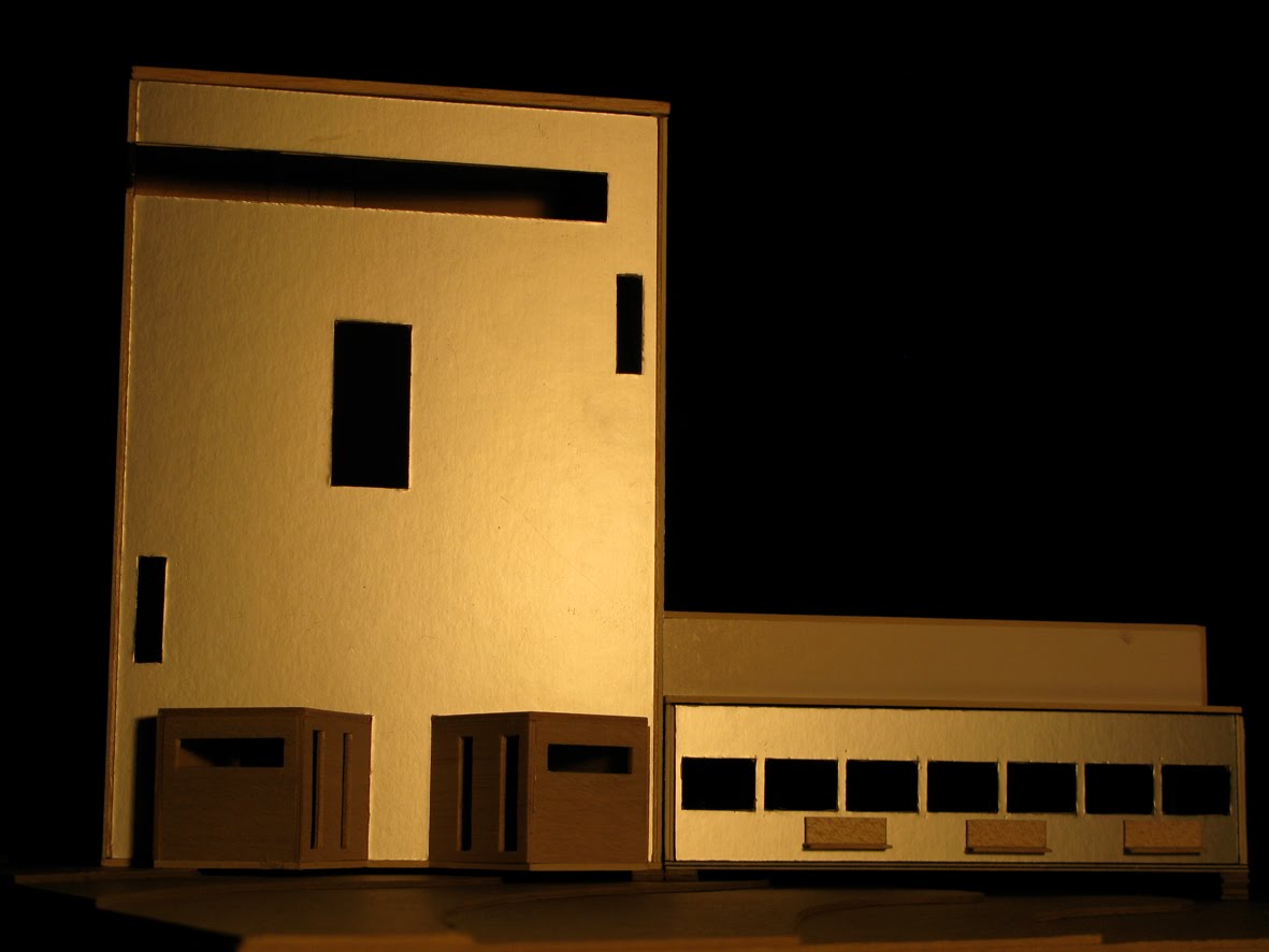
I feel that this project has really assisted me in developing a way of working with architectonic ideas and spacial visualisation, and cultivating my architectural sensibility. This was due to the clever way in which the brief was set up to provide us with a framework to operate within, where we could explore, test and implement ideas. The ideas that I  found to be central to the project and explored through my architectonics were: how to organise and regulate spaces in relation to a narrative that set an underlying purpose and tone; the importance of openings in spaces, and their essential contribution to the atmosphere and way that we experience a space; and how to graphically(parti/poche) distill and express my concepts and physically(model) realise them, in such a way that the two mediums complement each other and are able to convey a cohesive idea.

I developed my project constantly by working between two mediums, rethinking and redrawing the organisation of my initial parti diagram, and using the initial study model to quickly test these ideas- just being able to realistically see myself in the space and apply different lighting effects to it to see the changes in atmosphere. The making of the study model was also essential for me in formulating a sense of how to make the final model and the materials I would use. I found this preferable to using SketchUp as a visualisation tool, because its functions for moving around the spaces just don't allow for the direct, real connection that a large scale model does. I think the usefulness of SketchUp came in the initial stages of the project as a quick way of playing with form and general spatial arrangements. For a images of the parti/poche refer to posts 'Project 2:Wk 4 Third+Fourth Attempts'. For a more indepth explanation of the final model refer to post 'Project 2: Wk 4 First Attempt'.